Universal Design by Jaclyn Packer, PhD

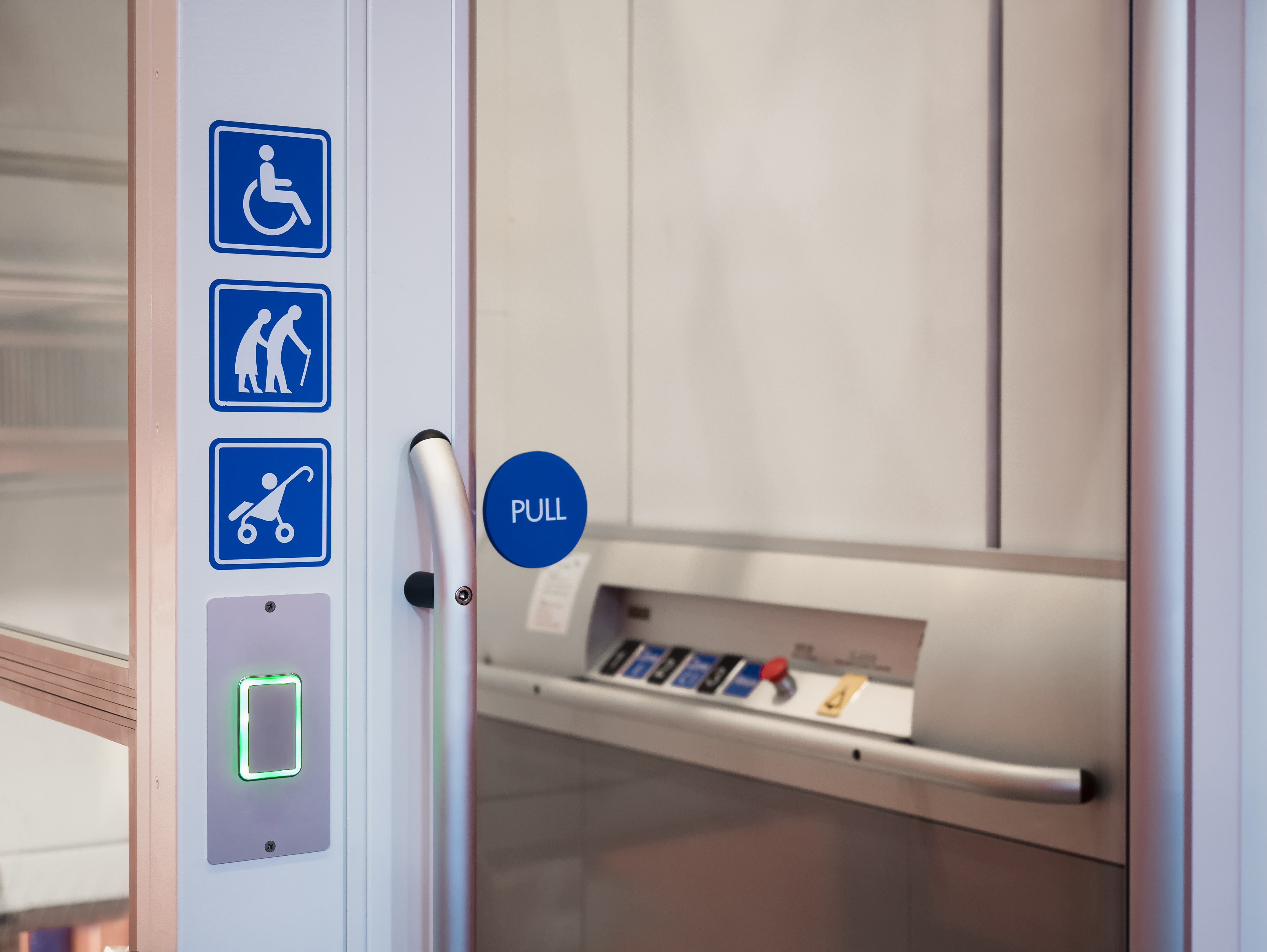
Universal Design is a concept we hear about a lot when talking about various types of disability. What does it mean? I would define it as the idea that everything that is created should be usable by everybody regardless of disability, age, gender, or other physical characteristics. This principal should apply to all areas of life, including public spaces, homes and apartments, products such as furniture or toys, and all information presented virtually (that is, by computer or other electronic devices) including educational materials. No one should be left out because the design of something does not allow them access.
Groups of employees working on design can benefit from diversity, that is, hiring people with a variety of backgrounds, races, gender, ethnicity, disabilities, etc. It’s not a stretch to assume that much of the technology we use today was developed by young non-disabled white men. As a result of this, much of the technology is more problematic for those of us who do not fit this category.
Here are some examples:
- An example from my own life is that years ago I bought one of the first Android phones. I went to register my device and found that I couldn’t add my birthdate. The engineers who developed the phone (I assume mostly young men) apparently didn’t conceive of any user who could be older than 35! As a result, the registration process limited users to choosing
only those birth years. - When the iPhone first came on the market it was discovered that people with long nails (generally women) had difficulty using the touch interface. Research has shown that facial recognition software does a very poor job of accurately identifying women and people of color, while working best on men with light skin.
- These examples demonstrate the importance of designers and engineers keeping people of diverse backgrounds in mind when designing products, and the best way to do this is by including a wide variety of people in the design and testing process. It’s essential that these considerations come early in the process so that these types of issues are not discovered only after distribution, when it is usually too late to fix the problems.
The needs of people with disabilities have to be considered at the very beginning of design in order for the final result to be accessible. If access is only considered once a product is completed, alternatives or workarounds are often less than ideal. Having several wheelchair-inaccessible building entrances and then choosing one to reconstruct for access often leads to those entrances being less convenient to get to and located in lower-trafficked areas of a building. All people would benefit from every entrance being accessible. In the past, when web technology gave little thought to disability access, many websites eventually provided access for those with visual impairments by providing a separate website that was text-only. However, having two separate sites required extra upkeep and the alternative version was usually the one that suffered by not being updated as often, if at all.
Disability access often has the added benefit of being more usable by a wide range of people, disabled or not. When I was a child, the Americans with Disabilities Act (ADA) did not exist and I don’t believe there were any curb cuts in the sidewalks I used in New York City. Once the ADA passed, most streetcorners had curb cuts. I began to notice how this “accommodation” for people with disabilities also benefitted many other groups of people, including those transporting heavy packages on utility carts and parents who used baby carriages or strollers. While benefitting many, it did not appear to affect others negatively. Another example is closed captioning which was developed for people who are deaf or hard of hearing. Captioning has been shown to be a great benefit to hearing people who watch television in loud spaces, such as a crowded bar. While universal access is ideal, conflicts sometimes arise. There are circumstances where access for one person can mean poor access for another.
Examples include:
- When curb cuts were first installed in cities, it was discovered that blind people using mobility canes often could not detect the slight downward ramp of the curb and might find themselves out in traffic when they thought they were still safely on the sidewalk. After realizing this, raised material was later added to the surfaces of curb cuts (called detectable warning surfaces) so that blind people could detect where the sidewalk ended.
- Choosing to lower an elevator button panel so that people of short stature and people using wheelchairs can reach the buttons, may result in inaccessibility for tall people, especially those who experience pain bending down.
- People who are blind may benefit from audible cues that signal a traffic light changing (such as tweeting or beeping), however the noise might be bothersome to people with sensory sensitivities.
While these conflicts are challenging, it is important to consider all people with access needs and to try to strike a balance that benefits the most people while minimizing inconvenience to others. Thoughtful universal design, considered from the very beginning of a project, should lead to increased usability for most people regardless of their various individual characteristics.

